The Door


The Product:
An ordering app for a popular local Jamaican restaurant called The Door.
Project duration: 11/21- 2/22
The Problem | The Goal
This is a restaurant with high traffic but an app for making take out orders is not yet available. Take out can be ordered by telephone only, & website orders can only be done for large catering.
User Research
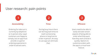
I conducted interviews with current customers of The Door to get a better sense as to why they order out and what would make an online order experience preferable to the current options of ordering take out either over the phone or in person only.
The sample user group helped define and refine the flow of the app by bringing insights into certain aspects that would make the app more expedient and easy to use. User personas with substitute avatars were implemented to protect participant privacy


Starting the Design
-
Based on user feedback, I opted to give users an option to check out immediately in case they were in a rush. A special of the day with a user rating may help them along in regards to making a quick choice.
-
User profiles were eventually taken into consideration so that users may actually use the ratings feature. With the profiles the user could build reward points and even return to rate past meals.
-
A low-fidelity prototype created a platform for me to test the user flow and identity any pain points that may have been overlooked.
Refining The Design
-
The heavy green background was deemed a little dreary, colors were then adjusted and the wood grain texture was removed to simplify the layout.
-
The final high-fidelity prototype had a brighter color scheme, larger pictures, and a footer oriented nav bar to make one handed navigation easier.
-
The lower screen oriented nav bar makes maneuvering the site much easier for someone that may be physically disabled, allowing for one handed navigation.


Final Mockups
The brightened color scheme was served to make objects and text stand out much easier. Text that pops out also helps with screen readers. Pictures are much larger in the high fidelity iteration for the visually impaired.
Takeaways
-
The heavy green background was deemed a little dreary, colors were then adjusted and the wood grain texture was removed to simplify the layout.
-
The final high-fidelity prototype had a brighter color scheme, larger pictures, and a footer oriented nav bar to make one handed navigation easier.
-
The lower screen oriented nav bar makes maneuvering the site much easier for someone that may be physically disabled, allowing for one handed navigation.
347-232-5165


